For the past 9 years, Myposeo’s tools have been constantly evolving to better address SEO issues. We are pleased to announce that we have been working for several months on a new interface to improve your tool user experience.
The new interface will be implemented gradually (over several months) starting with a new sidebar and top bar that will optimise navigation.
Myposeo Pro, Starter et Agencies
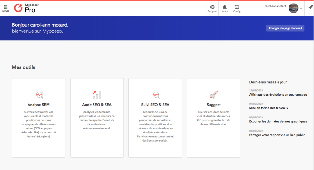
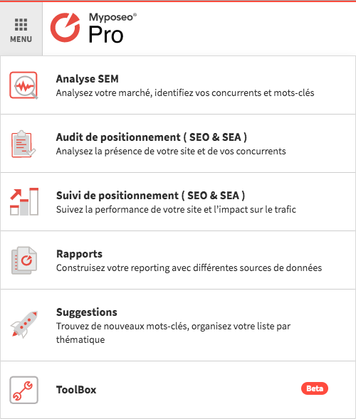
The old navigation
You had two ways of accessing the tool:
- via the tool home
- via the top left menu
New sidebar
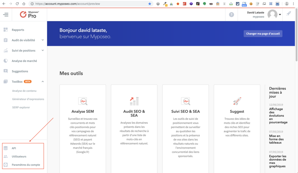
Today, the tools will still be available on the homepage but a sidebar on the left side will be displayed at all times whilst you navigate.
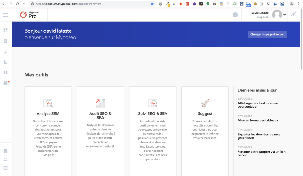
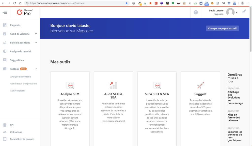
The sidebar will open when you hover over it, but you can freeze it by clicking on the “burger” menu. It’s up to you to choose the display according to the way you work (full-screen mode, tools always visible…).
Lightweight top bar
The News icon, which was present on the top bar, has been temporarily removed. You can still access the latest news and updates on the homepage.
This homepage will soon evolve.
Note that preference management is now accessible at the bottom left of the sidebar (API, Users, Account Settings) and no longer in the top bar.
Myposeo Insights
Lightweight sidebar
Myposeo Insights has also received a small change and has a new sidebar.
Before the update:
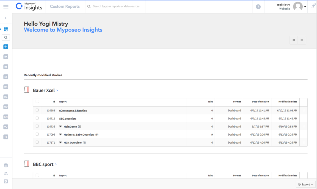
After the update:

The graphically lightweight sidebar will open when you hover over it, but you can freeze it by clicking on the “burger” menu.
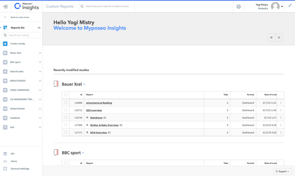
As with the Pro, Starter and Agencies versions, preference management is now available at the bottom left of the sidebar (API, Users, Account Settings).
Data sources
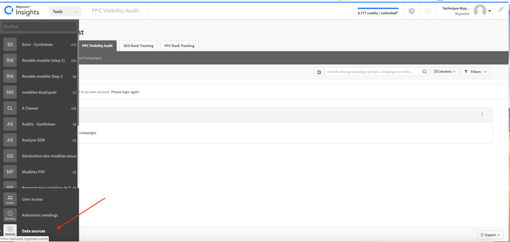
Previously, you could access the other Myposeo tools via the “Tools” drop-down list at the top left.
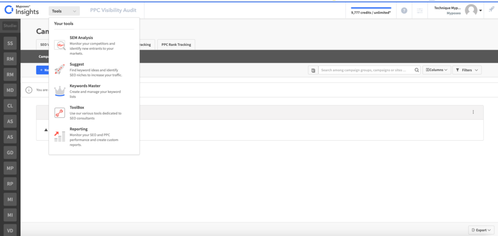
Or via the “Data source” tab available at the bottom of the left sidebar.
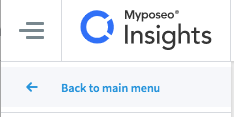
From now on, the tools are directly accessible in the new sidebar, for that you have to click on “Back to the main menu”.
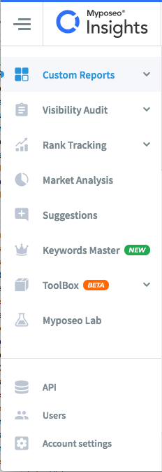
Then you access the list of tools:
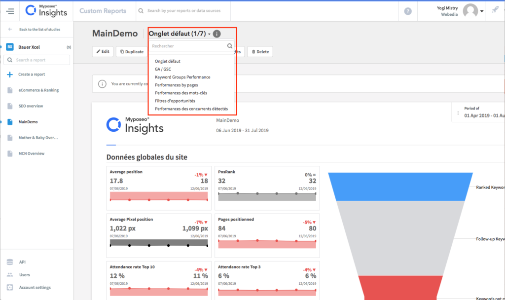
Another new feature is that when you are on a report with several tabs, you can find them all by clicking on the drop-down list next to the report name.
New tool names
We have redesigned some of the titles in order to give you a better understanding of the tools:
- Audit = Visibility audit
- Tracking = Rank tracking
- SEM analysis = Market analysis
Other developments will be deployed in the coming months. Stay connected 🙂
We hope you enjoy all these changes and would be delighted to hear from you!
Carol-Ann
Marketing manager @myposeo, community manager and writer.
- More Posts (664)

